Documentation Index
Fetch the complete documentation index at: https://magicpatterns.mintlify.dev/docs/llms.txt
Use this file to discover all available pages before exploring further.
General Tips
- Our biggest tip is to be SPECIFIC. Select Mode helps because providing “context” to the AI is key to getting accurate results. Remember that the AI cannot read your mind.
- Getting an error? Use the
/Debugskill. - Attach screenshots when creating designs
- Use ChatGPT to generate a prompt for you. The more specific the better.
- Don’t see any changes? Ask the AI to explain what it did. Switch to
/Askmode. For example, It might have made a new page but didn’t link a button to it.
Select Mode and Visual Edit
Select Mode lets you click on specific elements in your design to tell the AI exactly what you want to change. How to use Select Mode:- Toggle on Select Mode from the bottom-left corner of the chat
- Click any element in your design (button, text, image, etc.)
- This will open the Visual Edit panel.
- By default, the “context” of what you have selected will be added to the chat.
- Optional: edit visual properties manually in the panel and then click “Save.”
When to use Select Mode
- When the AI is changing the wrong thing
- When working with complex, multi-section designs
Chat Modes, Skills, and Integrations
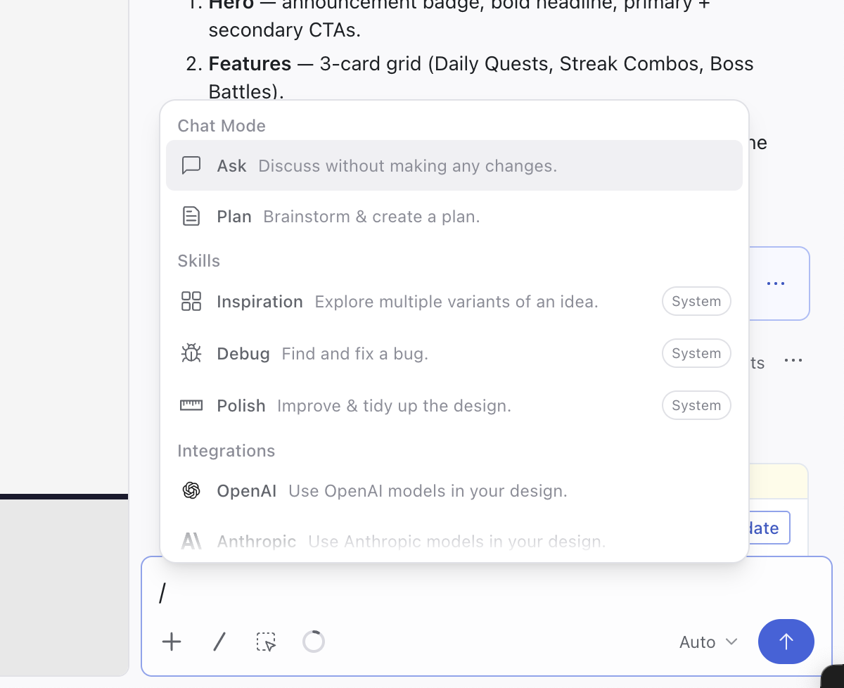
Type/ in the chat input to open the menu. You can also use Chat Modes and Skills straight from the dashboard initial prompt to kick off a new design.

Chat Modes
Chat modes change how the AI responds to your next message and stay active until you switch them./Ask
Chat with the AI without generating code (great for planning or asking questions).
/Plan
Plan a change with the AI before it edits your design. The agent asks a few clarifying questions, drafts a structured plan you can edit, and only writes code once you approve it. Useful for larger changes when you want to align on the approach first.
Read the full Plan Mode guide.
Skills
Skills are powerful default prompts that help you work more efficiently./Debug
If the AI is in a doom loop or not following instructions, the /Debug skill uses a special prompt template to help debug the issue effectively.
/Inspiration
Generates 4 different design variations to explore options.
/Polish
Cleans up your design with better spacing, alignment, and visual hierarchy.
Integrations
The/ menu also gives you access to your Integrations, so you can pull in services like OpenAI, Anthropic, or Feedback collection without leaving the chat.
Using Version History
Reverting to a previous design
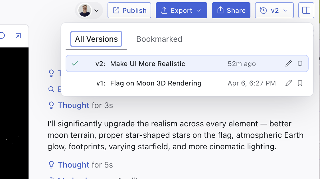
To revert back to a previous design, take advantage of version control by simply clicking the preview you want to revert to or select from the versions dropdown.
Prompting Dos and Don’ts
| ❌ Don’t | ✅ Do |
|---|---|
Don’t be unclear: checklist with 4 sections with 3 tasks each showing progress | Do be specific: four sections with 3 checkboxes each. There should be a progress bar for each section that changes according to the number of checkboxes checked |
Don’t omit component names: a box for checks in a list in screen thing | Do use component names: Three checkboxes in a list in a modal |
| Don’t upload lengthy PRDs expecting perfect results | Do break down large changes into smaller, focused updates |
| Don’t give broad instructions like “make the page cleaner” | Do use the /Polish skill |
| Don’t keep prompting when results become inconsistent | Do fork your chat, roll back to a previous version, or ask the AI to reflect on what’s going wrong |
How to use Existing Styles
Read key concepts to learn more about Design Systems and components.- The models have become quite good! Try uploading a screenshot of the design you want to use as a starting point.
- Do you have an existing component library? You can create a Design System to organize your reusable components and ensure consistent usage across all your designs.
- Use Rules to configure default styles like “always use #228B22 as my primary button color.”